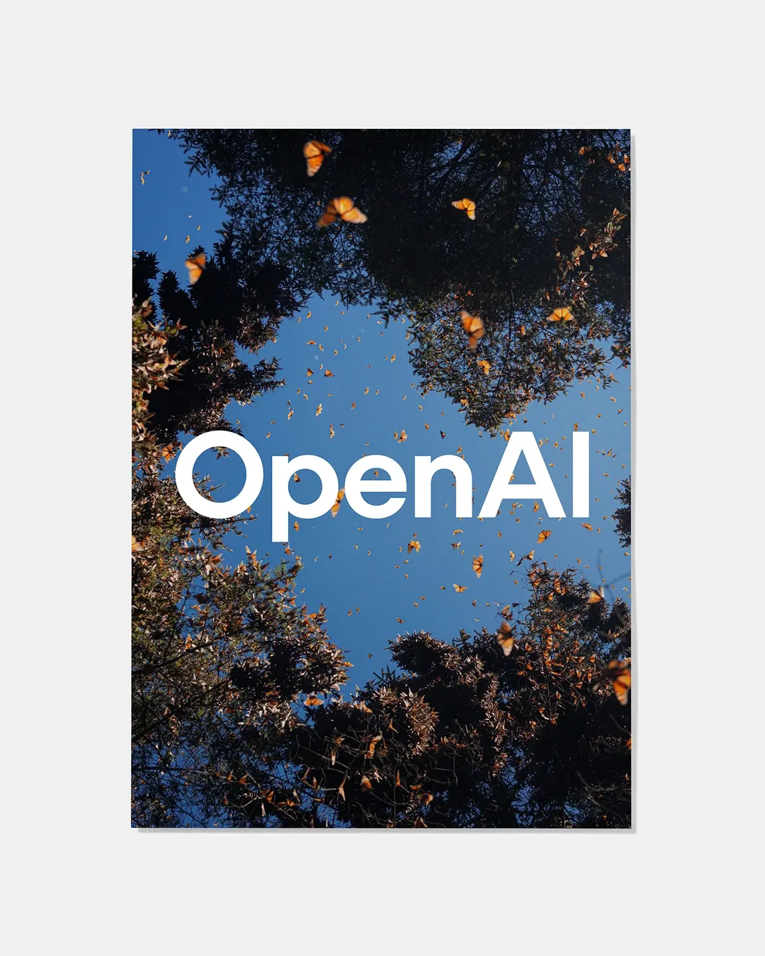
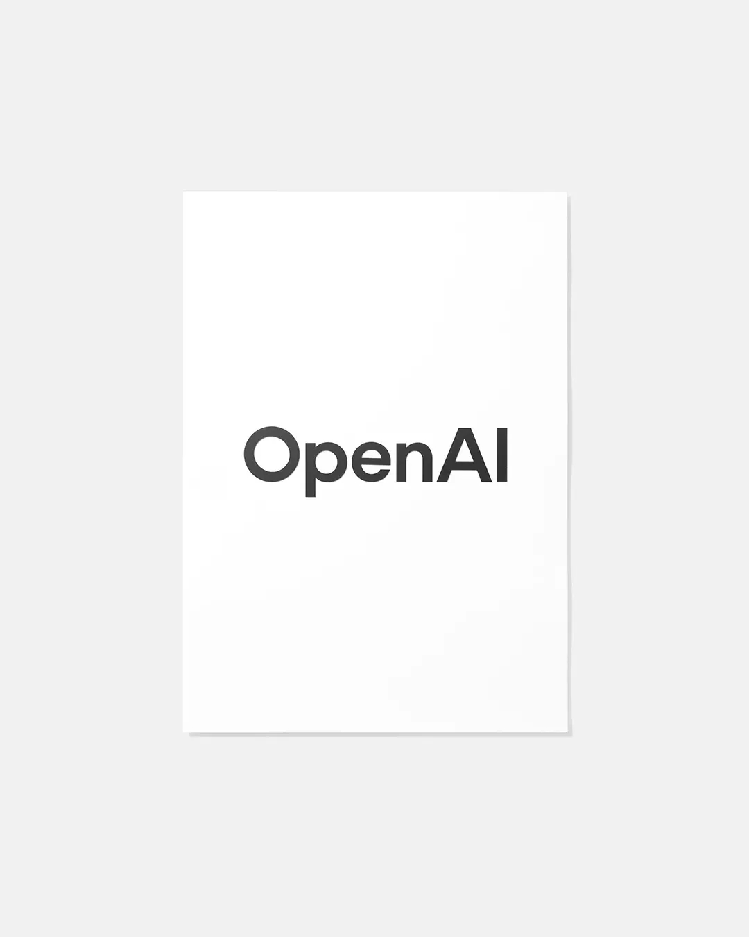
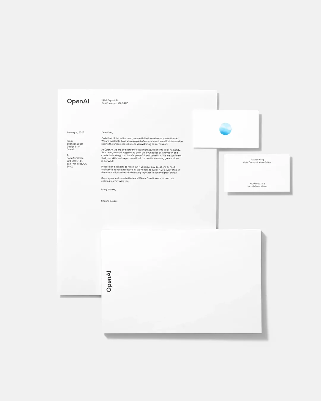
OpenAI has unveiled an updated brand identity. The new branding focuses on the OpenAI wordmark, shifting away from the company's previous reliance on its distinctive blossom logo toward a more minimalist approach.
Key Points
- OpenAI has redesigned its branding, focusing on a new wordmark.
- The new look features ‘OpenAI Sans,’ a custom typeface designed for clarity and consistency.
- The Blossom logo remains but will be reserved exclusively for OpenAI Research.
The updated brand sports a new custom typeface called OpenAI Sans, which has already rolled out across all the company's platforms, including its website and the ChatGPT iOS app. The typeface balances geometric precision with approachable, rounded characters.
The company's iconic blossom logo isn't going away. However, the company is reserving it to be used exclusively for OpenAI Research moving forward. This shift in visual identity suggests a broader evolution in how OpenAI wants to present itself to users and partners as it transitions from a non-profit organization.
Overall, the new design system creates a more cohesive visual language across OpenAI's growing portfolio of products and services, while maintaining a professional and contemporary aesthetic.
As the company balances commercial growth with its commitment to beneficial AI development, the new brand identity provides a foundation that better aligns with its current trajectory.